

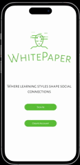
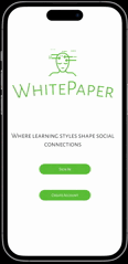
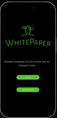
WhitePaper Mobile App
Current social media platforms though immersive, have yet to be developed with the central focus of connection through learning.
Existing social media platforms have yet to create an experience that highlights learning as a primary medium of social interaction. This gap in the industry misses an opportunity to promote education in tandem with social connection.


Solution
A social media platform with a value proposition connoting social connection via shared learning styles/goals.
Assistive
-
Tools that guide the user allow in-app experiences to be simplified.
-
Universal CTA elements allow users to identify which actions to take easily.
Equitable
-
Accessibility is the application's design framework, allowing underrepresented groups to be accounted for.
-
Accompanying icons with text allows the application to be text-to-speech compatible.
Immersive
-
The utilization of whitespace creates a visually immersive look & feel of the product.
-
Navigation is structured as audio, text, and visual content. Promoting further customization capabilities.
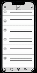
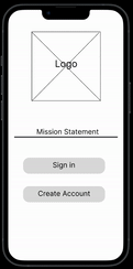
Before

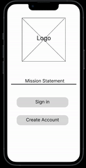
After
Research
Participants wanted aesthetics to match prototype settings & more navigability on desired screens.
-
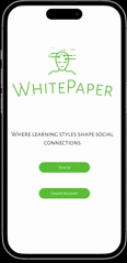
4 out of 5 participants needed the logo to be visible within the prototype design.
-
4 out of 5 participants needed easier backward navigation when on the profile screen.
-
Fonts, ‘CTA’s (Logo), & Information Architecture were refined for a more intuitive feel and uniform brand identity.
-
Prototype features were refined to enhance user interactivity.
Competitive Analysis
The competition offered a limited range of accessibility options.
The competitive audit revealed a gap within the existing market, with applications having limited in-app accessibility options. This allows an application centered on accessibility concerns to serve as the value proposition in the mobile app design.


Usability Study
The goals of the usability study were to refine the functionality of the application's design and learn ways to increase the application's interactivity.
In designing a social media application centered on learning and information sharing, we emphasized connection in a safe and inclusive environment via shared learning goals. Before launch, we needed to determine if the application was efficient, feasible, and an instrument of social good.
Research Questions
-
What can we refine or add within the primary user flow?
-
What can we learn from the primary user actions?
-
What can be improved in the applications' navigability and ease of use?
-
What can be refined or added to the application’s design to enhance interactivity?
-
What are the secondary user actions within the application?

Key Takeaway
Users are looking for the prototype to mirror the finished product as closely as possible.
Where the competitive audit revealed a gap in the market with limited accessibility options, the usability study revealed that users are looking to have in-app experiences that closely model the finished product's design.
How Might We
How might we create a social media application centered on learning and information sharing that is accessible, equitable, and immersive?
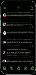
Considering user pain points: the goal was to create a mobile application that emphasized connection via shared learning styles/goals. The home screen highlighted a text-based social feed, whereas ancillary social feeds highlighted audio and visual learning styles. The app's Accessibility Hub allowed for numerous accessible & customization options.


Testing
Throughout the iteration process key improvements within the design were as follows:
Before
After
Steps toward brand identity
-
The top toolbar design was refined to allow the logo to be visible with iPhone 14 Pro prototype settings.
-
Utilization of whitespace to enhance visual appeal & promote intuitive interaction.
-
CTAs and clickable elements are clearly defined to ease user navigation.
Creating a cohesive user flow
-
Backward navigation from the profile screen is added to enhance navigation
-
Prototype interactivity enhanced usability in the second phase of usability testing.
-
The screen with details was also allowed as an option during the testing phase.

Color Style Sets & Font Style
Light Theme

Dark Theme

Font Style

Product Development -Next Steps
The ways in which the existing product can be improved after launch and ways to gauge the product's success
After launch, there needs to be a way to gauge the product's success and refine features within the existing design. Here are some actionable steps that can be added to this iterative process.
1. Continue to build upon learning-style social feed features - Connection via shared learning styles is a core component of this product's offering, so finding ways to iterate and expand upon the existing features is essential. The best way to determine which direction to take the product next would be to gather insights from users once the application has gone live. We can accomplish this through incentivized user surveys and polls posted by application developers on their social feeds. This approach will promote interactivity and allow users to feel like they are a part of the product.
2. Enhance accessibility options for a tailored user experience -The competitive audit revealed a gap in the market regarding in-app accessibility options, which resulted in accessibility becoming a unique value proposition for the product. Designers and developers should consistently look for ways to enhance this area of the application and find ways to make this feature more forward-facing within the product's presentation. User surveys and interviews with users who actively utilize the accessibility features of the app will aid in this. Finding ways to promote this element as integral to the product's development to users will allow for a humanity-centered design and the underlying mission of the product.
3. Conduct a usability study three months after launch to gauge the success of newly integrated features - An additional usability study will be conducted with the live application at the three-month mark. This will provide us with fresh data to analyze the application's successes and failures. Participants should be pooled randomly and from a large data set that closely resembles the population. This will allow for novel insights in conjunction with objective and unbiased feedback.
Conclusion - Lessons Learned
What the process taught me, things I'd do differently
Being my first undirected personal project upon completing the Google UX Design Certificate Course, the goal of this project was to challenge my boundaries in design thinking and to refine my existing skill set. I'd like to share what the process has taught me and what I would augment within my design process.
1. Conveying the brass-tacks and highlighting key features - This case study was defined by highlighting the essentials of the product being developed. In previous projects, I would spend significant time fine-tuning menial aspects of the application; this project's focus was to express the key features of the product and expedite design decisions. I learned that as a designer, time constraints necessitate decisive action, and if the brass tacks are conveyed clearly, the journey from conception to launch can be accelerated.
2. A user's emphasis on interactivity - Focusing on the essential elements of the mobile app's design was a continual iterative process of determining which elements required focus and which could remain static. Yet, throughout user research, users highlighted a desire to interact with as many elements as possible. This taught me the necessity of interactivity within an application's design and how to weigh which features were essential despite constraints.
3. Simplicity on the other side of complexity - In fulfilling a gap within the social media market, I was able to explore the many applications and the features they provide. I learned that despite the simplicity of social media platforms, there is an immense amount of intricacy within their design. Their reason for being in demand is due to the simplification of this complexity that leads to intuitive in-app experiences. Good design in all markets should invariably check these boxes.