

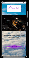
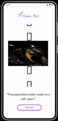
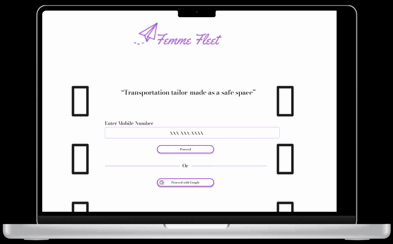
Femme Fleet Cross-platform Application
Existing car service applications have yet to fill the societal need to promote women’s safety exclusively.
Existing car service applications have yet to create an experience tailored to the safety needs of woman-identifying persons. This gap in the industry fails to address the gender-specific needs of women while commuting.
Solution
Designs that mirror the user's experience establish trust
Intuitive
-
A design framework based on simplicity allows user actions to be easily mapped.
-
Strategic placement of icons and clickable elements promotes ease of use.
Efficient
-
A concise set of user actions promotes application efficiency
-
A centralized user flow lessens user errors and increases application functionality
Customizable
-
Profile features advocate customization and personalizing the user experience.
-
Settings features allow for more in-depth customization options.
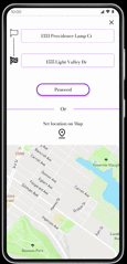
Before

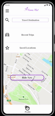
After
Research
Most participants needed elements in the design to remain consistently functional.
-
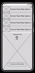
4 out of 5 participants needed the ride option feature to remain static in the design
-
3 out of 5 participants needed the search icon on the home screen to be functional.
-
Fonts, ‘CTA’s (Logo), & Information Architecture were refined for a more intuitive feel and uniform brand identity.
-
Prototype features were refined to enhance user interactivity.
Competitive Analysis
The competition offered a limited range of user customization.
The competitive audit revealed a gap within the existing market with applications having limited in-app language customization or accessibility options. This allows an application centered on user customization to serve as the value proposition in the cross-platform design.


Usability Study
The goals of the usability study were to refine the functionality of the application's design and learn ways to increase the application's interactivity.
In creating a woman-centered car service application, we emphasized a community of safety and inclusion for all women-identifying persons. Before launch, we needed to determine if the application was efficient, feasible, and an instrument of social good.
Research Questions
-
What can we refine or add within the primary user flow?
-
What can we learn from the primary user actions?
-
What can be improved in the applications' navigability and ease of use?
-
What can be refined or added to the application’s design to enhance interactivity?
-
What are the secondary user actions within the application?
.png)
Key Takeaway
Users are looking to have a greater range of control over their in-app commuting experience.
Where the competitive audit revealed a gap in the market with limited language and accessibility options, the usability study revealed that users are looking to have more control over their commuting experience in the testing & launch phase of the product.
How Might We
How might we create a woman-centered car service application that is cross-platform, safe, easy to use, and captivating?
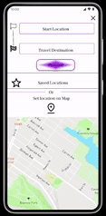
Considering user pain points: the goal was to create a cross-platform application that put the user in the driver's seat. The home screen served as the hub of the application's design, providing limited user actions within a personalized format. Iterations allowed visual elements to be highlighted within the design, such as white space, iconography, and text hierarchy. This resulted in a polished look and an intuitive feel for the product.


Testing
Key improvements in the design
Throughout the iteration process key improvements within the design were as follows:
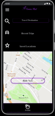
Before
After
Steps toward brand identity
-
Utilization of whitespace to declutter background & promote intuitive interaction.
-
The "Profile" icon is changed to match the brand and target market.
-
CTAs and clickable elements are clearly defined to ease user navigation.
Creating a cohesive user flow
-
Price points were allowed to be present earlier in the user flow.
-
The screen with details was allowed as an option during the testing phase.
Color Style Sets & Font Style
Light Theme

Dark Theme

Font Style

Product Development -Next Steps
The ways in which the existing product can be improved after launch and ways to gauge the product's success
After launch, there needs to be a way to gauge the product's success and refine features within the existing design. Here are some actionable steps that can be added to this iterative process.
1. Expand language and accessibility options- With the gap in the existing market being a limited range of in-app language and accessibility options, continuously iterating on these elements within the application will allow the product to maintain its edge. Exploring ways to expand the application's language data set and allowing for a greater range of accessibility will be instrumental in the application's following stages of development. These features should be introduced gradually, allowing existing users to become familiar with the application's current mental models, and should be tested with a pool of individuals who are to be most affected by said features.
2. Continue to expand the app's customizable features -User research revealed the users' desire to have a greater range of control in their commuting experience via the application. Consistently enhancing user customization will allow the application to establish a recognizable brand within the current market. Yet, these features should be for the user and by the user, encouraging feedback from the application's patrons to determine what users are most looking for in the application's design. We can accomplish this through surveys and user interviews and incentivized with free commute QR codes.
3. Conduct a usability study three months after launch to gauge the success of newly integrated features - An additional usability study will be conducted with the live application at the three-month mark. This will provide us with fresh data to analyze the application's successes and failures. Participants should be pooled randomly and from a large data set that closely resembles the population. This will allow for novel insights in conjunction with objective and unbiased feedback.
Conclusion - Lessons Learned
What the process taught me, things I'd do differently
Being the final UX case study in the Google Certificate Course, this project was to surmise the culmination of my study. I'd like to share what the process has taught me and what I would augment within my design process.
1. Some breakthroughs are sudden, and some take methodical effort - This case study was defined by incremental progress. Most breakthroughs in the design process were only after methodical effort and trying various solutions. In short, I realized beginner's luck does exist, yet continual effort and a desire to grow can lead to surprising results.
2. Designing to tell a story - In designing an application for social good, the community being served took precedence in many design decisions. Communicating the needs of the target user became a central focus. I learned unique ways to tell the story of the design process and mark key iterations in presenting my case study.
3. Designing under constraints necessitates tradeoffs - The most challenging aspect of this project was keeping the design decisions succinct. As the application progressed, I had to decide which aspects of the application needed showcasing and which ones were superfluous. I learned that tradeoffs are necessary to produce under constraints.