

Autism Champions Initiative Responsive Website
Existing ASD non-profit websites are informative yet difficult to navigate.
Existing donation flow websites for Autism Spectrum Disorder (ASD) are heavily information-based, making navigation difficult without a certain level of digital literacy. Most website designs aren't user-centered, resulting in an experience that feels "pushy".


Solution
Immersive design creates a memorable user experience
Immersive
-
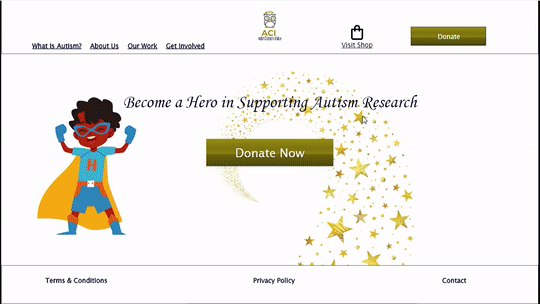
Visual design elements and the use of white space enhance the feel of the website.
-
The shop feature creates return visitors and adds value beyond the standard donation flow.
Concise
-
Clearly defined CTA elements allow for easy navigation.
-
The easy-to-follow homepage serves as the hub of the donation flow experience.
User-centered
-
The "Contact Us" messaging system promotes a user-centered experience.
-
A simple website structure promotes accessibility for underrepresented groups.


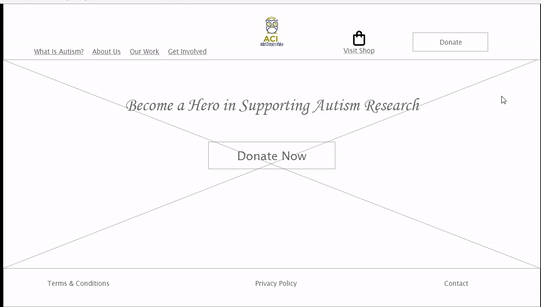
Before
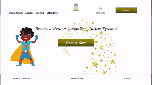
After
Research
Most participants wanted a more involved and interactive donation flow experience.
-
4 out of 5 participants wanted the prototype to have more features.
-
3 out of 5 participants wanted to interact with more elements within the prototype's design.
-
Fonts, ‘CTA’s (Logo), & Information Architecture were refined for a more intuitive feel and uniform brand identity.
-
Shop Feature was added to create an alternative for return visitors.
Competitive Analysis
Competition websites varied, yet the strongest traits highlighted intuitive design.
The competitive audit revealed a trend within the existing market, with the best applications having polished user interfaces. This allows an immersive website to serve as the value proposition in the website's design.


Usability Study
The goals of the usability study were to evaluate the functionality and ease of use of responsive website donation flow.
In creating an immersive donation flow experience, we emphasized ease of use, ease of navigation, & intuitive interaction. Before launch, we needed to determine if these benchmarks were met, how we could refine the design, and what we needed to add to promote intuitive interaction.
Research Questions
-
What are the primary actions a user takes within the website, and is the website’s design aligned with the goals of the user?
-
What can be added or refined within the primary user flow to enhance the user experience?
-
What is the most common click path for the user?
-
What areas of the website need modification and or refinement?
-
Is the website's overall navigation easily accessible, and what can be done to enhance ease of use?

Key Takeaway
Most users are looking for a donation flow website that has a diverse set of features and is aesthetically immersive.
Where the competitive audit revealed the trend of standout websites having an intuitive approach to design, the usability study revealed that users are looking for a website that offers an array of features beyond the standard donation flow function.
How Might We
How might we create a responsive website experience that is intuitively interactive and easily navigable?
Considering user pain points: the goal was to create a website that was identifiable and navigable. The home screen served as the hub of the website's design, encouraging uncomplicated site navigation. Iterations allowed visual elements to be highlighted within the design, such as white space, iconography, and text hierarchy. Resulting in a polished look and an intuitive feel of the product.


Testing
Key improvements in the design
Throughout the iteration process key improvements within the design were as follows:
Before
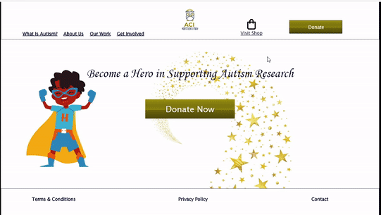
After


Steps toward brand identity
-
CTA's and clickable elements are designed to match the color pallet of the logo.
-
Enhancing visual design elements allowed interactivity to become the focal point.
-
Typeface and text hierarchy enhanced the aesthetic of the app's design.
Creating a cohesive user flow
-
Adding the “Back To Shop” button allowed for backward navigation.
-
The product "Size" indicator allowed for lateral movement within shop items.


Color Style Sets & Font Style
Light Theme

Font Style

Product Development - Next Steps
The ways in which the existing product can be improved after launch and ways to gauge the product's success
After launch, there needs to be a way to gauge the product's success and refine features within the existing design. Here are some actionable steps that can be added to this iterative process.
1. Continue to optimize the website's core features for efficiency and ease of use - With the impetus of creating the existing website being a gap between the user's experience and the desired actions of stakeholders, finding ways to incorporate humanity-centered design decisions that bridge this gap with feasibility is paramount. Finding ways to uncomplicate the user's journey of donating will result in higher conversion rates and return visitors. User feedback will be essential in gauging the site's success, optimizing existing features, and incorporating new ones. We can achieve this through user survey requests upon a completed donation. The survey will allow the user to reflect on their donating experience and provide insight into aspects of the experience they wish were different. The surveys will create an extensive data set to analyze and a cost-effective method of improving the site's core features.
2. Discover additional methods to make the site immersive - Aside from the website's core features, additional features that create an immersive experience for the user should be consistently explored. As it stands, the website's additional feature is its 'Shop' option. Upon a completed purchase, user surveys should be offered as a way of improving in this area. Finding what features would most likely create an immersive experience for the user should be pulled from a data set of individuals already engaging in one of the site's immersive features. Yet, an interactive learning module should be a feature worthy of further inquiry.
3. Conduct a usability study three months after launch to gauge the success of newly integrated features - An additional usability study will be conducted with the live application at the three-month mark. This will provide us with fresh data to analyze the application's successes and failures. Participants should be pooled randomly and from a large data set that closely resembles the population. This will allow for novel insights in conjunction with objective and unbiased feedback.
Conclusion - Lessons Learned
What the process taught me, things I'd do differently
As it was my second UX case study and marked the halfway point in my Google Certificate Course, I learned a lot. I'd like to share what the process has taught me, as well as things I would augment within my design process.
1. Different software provides unique advantages and challenges - This case study required designing in Adobe XD, whereas the one prior introduced me to Figma. I discovered I developed a natural affinity to Figma's information architecture, yet was challenged to adapt to Adobe XD. In the adaptation, I learned the strengths and weaknesses of each software as well as how each highlights my strengths in design thinking.
2. Simple layouts can evolve into intricate designs - At the onset of this project, wireframes and low-fidelity prototypes felt bland and unimaginative. Yet, by allowing a simple structure to provide the outline of the design, the website became far more intricate than I could have anticipated. Subtle aspects, such as lateral movement within the store feature, created the immersive user experience initially intended.
3. Graceful degradation is challenging with a mobile-first philosophy - The most challenging aspect of this project was scaling down the desktop design to a mobile-friendly version. In designing the responsive website, I quickly learned the necessity of creating designs that are adaptable to various use cases. Rearranging and molding the mobile version to be adequate to the desktop version was a challenge, yet a clear example of why a mobile-first philosophy is common.