
Art History Mobile App
Art history in art galleries are being primarily catered to an english speaking audience.
With art history information being primarily catered to an English-speaking audience, those with English as a second language often encounter numerous challenges in obtaining such information. Challenges regarding vocabulary usage, or having to speak in their second language to receive insights into a particular artwork serve as major pain points in the art gallery experience.


Solution
Language inclusivity extends the range of accessibility into the world of art
Accessibility
-
Allowing audio of art history descriptions to be presented in the user's native tongue
-
Providing language options for the top 25 most spoken languages worldwide.
Inclusivity
-
Creating an immersive in-app experience tailored to the user's tastes
-
Allowing for customizable content within the application's design
Feasibility
-
An easy-to-follow design structure promoting ease of use
-
An interactive user flow highlighting user engagement
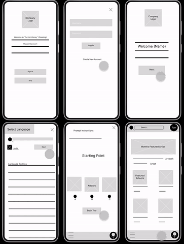
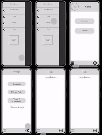
Before
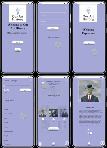
After
Research
Most participants wanted a more visually appealing design within the prototype.
-
3 out of 5 participants found the prototype design visually unappealing
-
2 out of 5 participants found the certain screen layouts to be inconsistent
-
Fonts, ‘CTA’s, & Information Architecture were refined for a more intuitive feel and uniform brand identity.
Competitive Analysis
The competition had limited or no language options for ESL users.
The competitive audit revealed a gap in the existing market, with most applications having limited or no language options. This allows a linguistically diverse platform to serve as the value proposition in the application's design.

Usability Study
Goals of the usability study were to refine the functionality of the application's design and learn what can be improved.
In creating an application that extends the accessibility of art history information, we identified this can best be accomplished through language inclusivity. Before launch, we needed to determine what aspects of the existing application design needed to be refined and to identify any pain points regarding navigation, accessibility, content, and overall application design.
Research Questions
-
What are the primary user actions within the application?
-
What can we refine or add within the primary user flow?
-
What can we learn from the primary user actions?
-
What can be improved in the applications accessibility and ease of use?

Key Takeaway
Most users are looking for a visually appealing application design with a uniform brand identity.
Where the competitive audit revealed the need for more language-inclusive solutions, the usability study revealed that users are looking to engage with applications that have a visual appeal and cohesive brand identity.
How Might We
How might we create an immersive in-app experience, that is both aesthetically captivating and language inclusive?
Taking the user journey into account, the aim of the home screen was to serve as the hub of the application's design with the artwork serving as the centerpiece. Iterations allowed for key elements within the design such as language, and overall user flow, to be highlighted. Resulting in a clearly defined look, and an easily navigable user experience.

Testing
Key improvements in the design
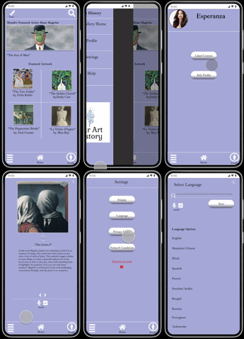
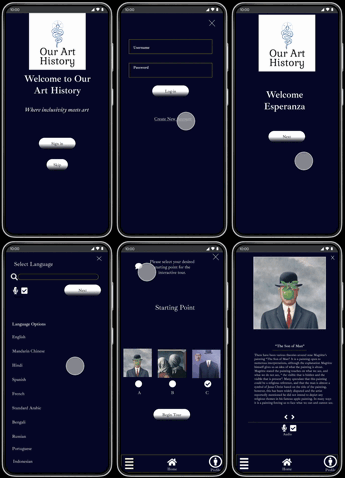
Throughout the iteration process key improvements within the design were as follows:
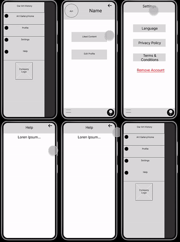
Before

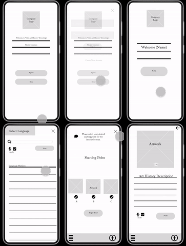
After
Steps toward brand identity
-
CTA's and clickable elements are given a smoother feel.
-
"ESL" text is changed to "Language" to be easily identifiable to a larger audience.
-
Selecting a text font that matches the aesthetic of the app's function.
Creating a cohesive user flow
-
Removal of unneeded buttons (i.e. back buttons on particular screens)
-
Allowing hamburger menu design to be hub of user flow

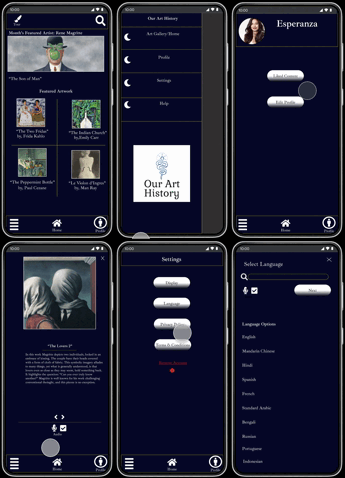
Color Style Sets & Font Style
Light Theme

Dark Theme

Font Style

Product Development - Next Steps
The ways in which the existing product can be improved after launch and ways to gauge the product's success
After launch, there needs to be a way to gauge the product's success and refine features within the existing design. Here are some actionable steps that can be added to this iterative process.
1. Find ways to account for a larger range of underrepresented groups - With accessibility being the gap in the current market, we should look for additional ways to maximize this opportunity. User research can be conducted to find unique ways to tailor the art gallery app experience to the overlooked groups. This research will be in the form of user surveys and user interviews. This research method will require less time and resources but will give us the necessary data to incorporate the app's newest features.
2. Explore additional methods of expressing language as the value proposition - With language being the application's unique value proposition, we should consistently look for ways to expand this feature within the existing application. Steps to develop the language database, as well as methods in which the user can experience the application in their native language, should be explored. User feedback at this stage of the product is crucial, as it will allow us to refine the existing design and introduce new features per user requests. Allowing users to feel they have a hand in developing the application establishes trust and creates a solid product.
3. Conduct a usability study three months after launch to gauge the success of newly integrated features - An additional usability study will be conducted with the live application at the three-month mark. This will provide us with fresh data to analyze the application's successes and failures. Participants should be pooled randomly and from a large data set that closely resembles the population. This will allow for novel insights in conjunction with objective and unbiased feedback.
Conclusion - Lessons Learned
What the process taught me, things I'd do differently
Having this as my first UX case study and introduction to UX design, there is still much to learn. Yet, I would like to share what the process has taught me, as well as things I would augment within my design process.
1. Saving each transition of the design throughout the iterative process - It wasn't until after the first lo-fi prototype usability study that I began to save a copy of each transition within the iterative process. This process has taught me that it is essential to look for ways to communicate design thinking, and marking each transition in the design is a handy tool for expressing such.
2. Focusing on consistency, not perfection - As an introduction, this project stretched my limits in ways I didn't initially anticipate. It required me to go beyond what was comfortable yet find a way to illustrate what I considered essential. This process has taught me the importance of consistent iterations. In consistently looking at how the design can be improved, I've learned to expect mistakes and accept them as a sign of learning.
3. Experiment with ideations throughout the design process - As obstacles arose within the design process, I found myself drawing from many aspects of ideations as a means of problem-solving. Ideas that seemed irrelevant at first ended up being key factors in solving design challenges. This process has taught me the importance of the ideation phase throughout the design process.


